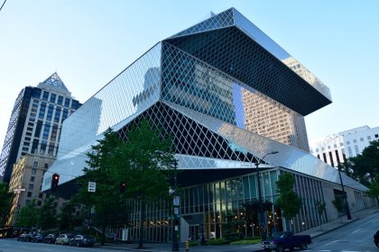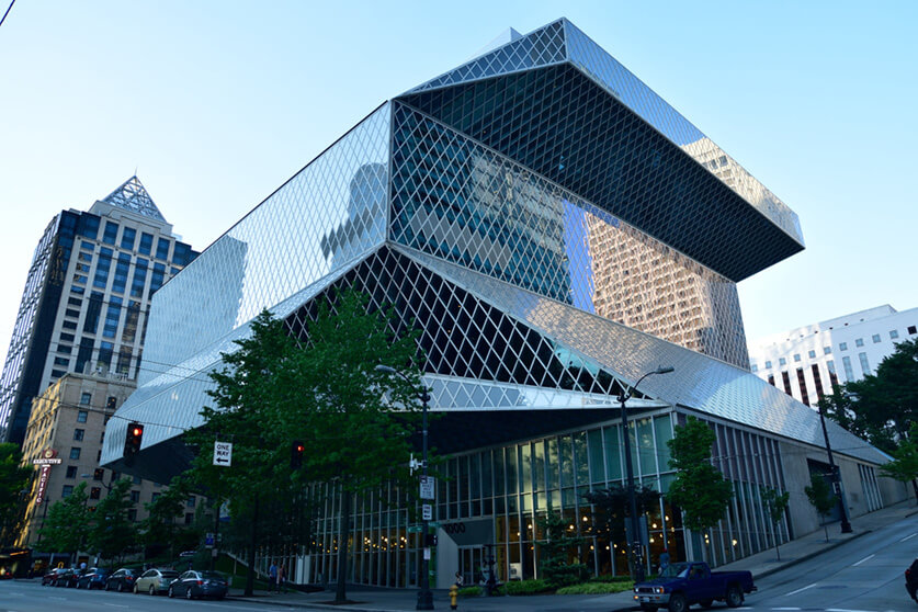

At first glance, the Seattle Central Library seems like an arbitrary exercise in geometry. On closer inspection, there is indeed a method to the seeming madness.
New York Times architecture critic Herbert Muschamp said the following about it: “In more than 30 years of writing about architecture, this is the most exciting new building it has been my honor to review.”

Architect Rem Koolhaas of OMA analyzed the client’s requests and reinvented the structure. He consolidated the library’s services and arranged them onto their own floors. Koolhaas also solved problems like collection growth over time and reducing the time required to find a librarian.
The logic to the building becomes apparent when you take a look inside. Each floor is arranged according to a theme: parking, staff, meeting, reading, and administration. The floors are staggered which gives the building it’s unique look. The purpose of the staggering was to create overhangs on street level (as stipulated by the city planners), open up space inside the library, and allow for views of Mount Rainier and Elliott Bay, to name a few.
The floor that contains the books was created on a spiral ramp in order to keep all of the books together while allowing them to follow a logical order and includes room to grow. It’s also accessible if you are in a wheelchair.
This innovative solution to what a library can be puts the people first. It will be interesting to see if more public buildings adopt this unique approach.


